Why Trust Gadgetbyte?
At Gadgetbyte, we invest substantial hours into rigorously testing each product or service we review, guaranteeing that you make informed purchases. Learn more about our testing process.
Review Overview
Design
7/10
Display
7/10
Control
9/10
Battery
8/10
Software
9/10
Sensors
9/10
Fitness Tracking
8/10
Assorted Features
9/10
Companion App
7/10
Value for Money
9/10
Mobvoi has delivered an excellent value-for-money Wear OS smartwatch with the TicWatch E3. Powered by the top-of-the-line Wear 4100 chipset, TicWatch E3 is a formidable contender for the title of best smartwatch under $200. Yet, Mobvoi has had to cut corners on certain aspects like design and display to make that possible.
Hey… E3 is here! No, not the game expo event (that just ended) but a new Wear OS-powered smartwatch from Mobvoi. According to the company, the TicWatch E3 is an affordable alternative to the TicWatch Pro 3—and I believe Mobvoi has tried to accomplish that by making the right sacrifices. No fancy dual-display or other premium design choices here but what it retains from the Pro sibling is all the powerful hardware underneath. More on this review of the Mobvoi TicWatch E3.
Mobvoi TicWatch E3 Specifications:
- Weight: 32 grams (without strap)
- Dimension: 44 x 47 x 12.6 mm
- Display: 1.3-inch HD LCD panel, 2.5D glass
- Case: Polycarbonate and glass fiber, Panther Black color
- Strap: Silicone, Interchangeable (20mm universal)
- Strap Colors: Black, Yellow, Blue
- Chipset: Qualcomm Snapdragon Wear 4100 (12nm)
- Software: Wear OS by Google
- Memory: 1GB RAM, 8GB storage
- Connectivity: Wi-Fi (b/g/n), Bluetooth 5.0, NFC
- Audio: Speaker, Microphone
- Companion App:
- Water Resistance: IP68 rating
- Sensors: Accelerometer, Gyro, HD PPG Heart Rate, SpO2, Low Latency Off-Body
- Navigation: GPS + GLONASS + Beidou
- Functions: 24-hour heart rate, Blood oxygen, NFC, Step Counter, Workout Mode (21), VO2Max, Google Assistant
- Battery: 380mAh (Up to 1.5 days)
- Price in Nepal: N/A (Not launched yet)
Mobvoi TicWatch E3 Review:
Design
- Circular dial, Polycarbonate case
- 20mm (universal) silicone strap
- IP68 dust and water resistance
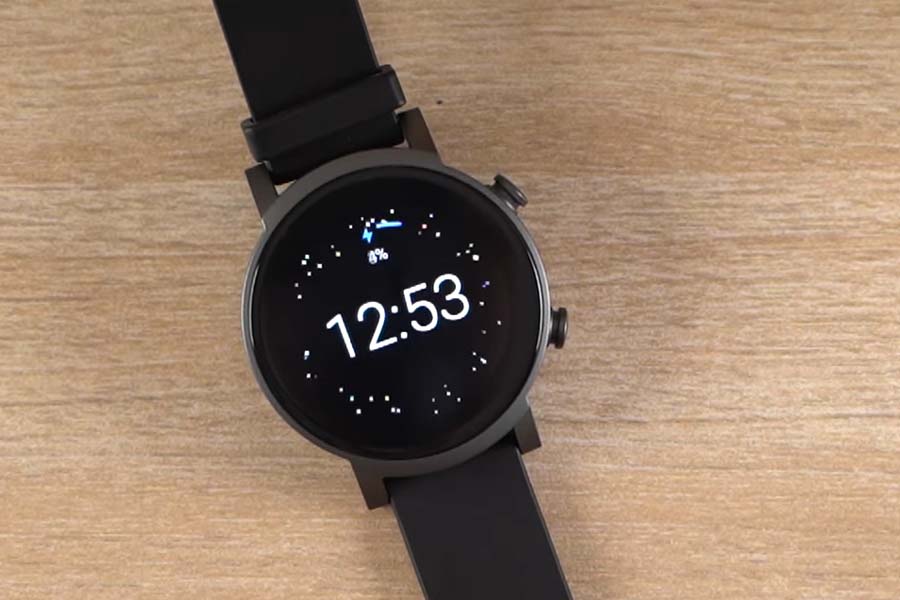
Kicking off this review with the design, the Mobvoi TicWatch E3 skips all the bells and whistles for a basic yet classy look. The circular dial has been carved from polycarbonate and glass fiber material. So, if you’ve been accustomed to stainless steel or titanium encased smartwatches, this one’s gonna feel cheap on the wrist.
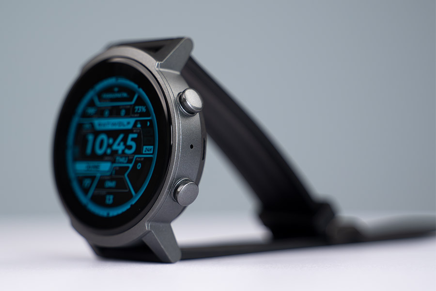
The plastic bottom half of the watch doesn’t scream luxury build material either—but hey—the E3 isn’t gunning for an elite design in the first place. This unisex smartwatch arrives in a solitary Panther Black case with a black strap by default, while Mobvoi says blue and yellow strap options are available too.
20mm universal strap
Regardless, if you have a 20mm universal wristband lying around, you can easily switch up the visual flair of this… otherwise bland smartwatch. Anyway, this pre-installed silicone strap can fit any wrist size and throughout my usage, it’s been comfortable and skin-friendly enough to discourage any doubts of allergy or skin irritation either.
Once again, it does feel a bit cheap but with the standout features inside (which I’ll be discussing shortly), I can easily look past it. Moving on, the right frame of the TicWatch E3 hosts two buttons for your navigational needs. But like the Pro 3, Mobvoi’s decision to skip a rotating crown feels like a missed opportunity.
The power button on the top takes you to the homescreen or launches the menu, whereas the other one can be customized to launch an app of your choosing. Moreover, long-pressing the former triggers Google Assistant while a double-press temporarily cranks up the illumination level.
Now, this brightness bump feature seemed weird to me at first but I soon found a use for it. We all know how Wear OS is notorious for sub-par battery life.
A quick jolt of brightness
So, to preserve as much endurance as possible, I’d kept TicWatch E3’s brightness to just 40% most of the time. But in sunny outdoors or similar well-lit environments, this would be insufficient. Thus, for a quick fix, this feature is a godsend. Still, I would’ve preferred if this shortcut was user-programmable as well.
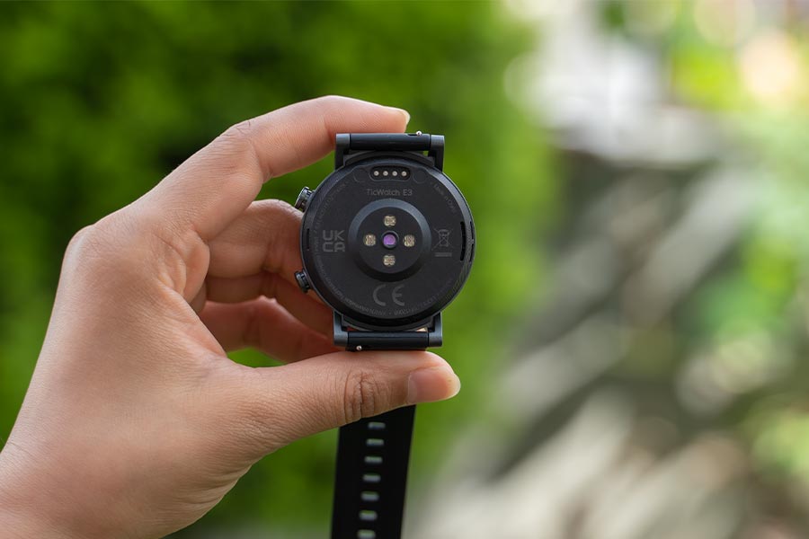
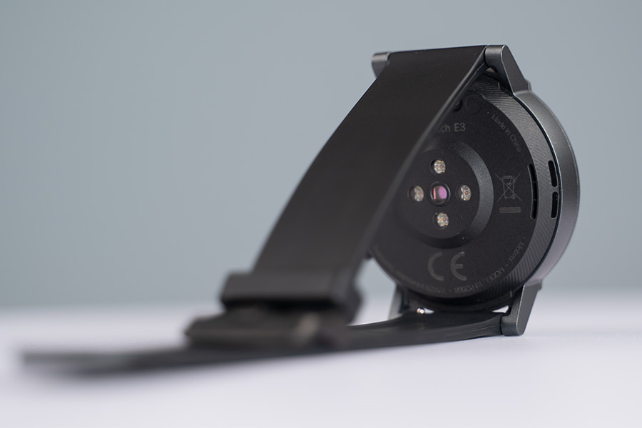
Besides the buttons, the right frame is where you’d find the microphone and beneath it—what I’m assuming—an exhaust vent. Similarly, the left frame houses the speaker grille whereas all the other health-tracking sensors are stacked on the bottom.
At any rate, the TicWatch E3 should speak to all those who find big, bulky smartwatches unappealing. With a circular dimension of 44 – 47mm and a strapless weight of 32 grams, I’ve had no problem wearing it to bed at night either.
Display
- 1.3-inches IPS LCD, 2.5D glass
- 360 x 360 px, Multiple watch faces
With that out of the way, let’s talk about the display. While the TicWatch Pro 3 shipped with a head-turning dual-display setup, that grandeur has been cut off on this low-cost alternative.
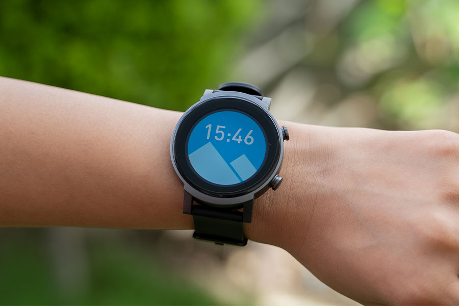
Even though I don’t mind the lack of a monochromatic FSTN screen, downgrading the AMOLED panel to an LCD is disappointing. As a result, colors don’t look as vibrant and punchy on this display and then there’s the power-efficiency concern too.
Additionally, the Mobvoi TicWatch E3’s 1.3" screen features a 2.5D curvature for a relatively premium look—and yeah, this does look nice. Anyhow, what I’m really concerned about is the lack of any Gorilla Glass protection here.
Questionable display protection?
Had it been sculpted from sapphire glass like the Huawei GT 2 Pro that we recently reviewed, my worry could be dismissable. But that’s not the case with the E3. What’s more, the display enjoys an open design—void of any protrusion from a tachymeter or minute markings—further complicating things by a bit.
Again, I wouldn’t have had to talk about this issue if only it were MIL-STD-810G compliant like most other smartwatches in this price bracket. But seeing how even the costlier TicWatch Pro 3 skipped this certification, Mobvoi was never gonna introduce it on the cheaper variant, to begin with.
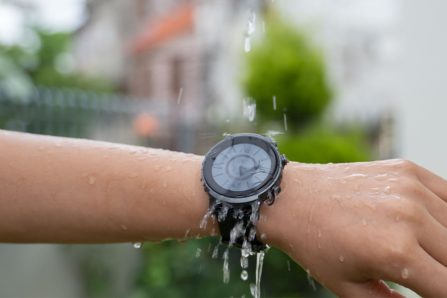
Still, I find some solace in the fact that the E3 is IP68 dust and water-resistant. So, just make sure that you refrain from bumping it to a tough surface and you should be fine. Throughout my usage, I accidentally smacked it against the wall once but the watch suffered no visible dent or other damage. That’s promising, huh?
Anyway, even though the 2.5D curvature accentuates the visual appeal, the surrounding bezel is abnormally thick and steals a potentially deluxe design. I feel like Mobvoi could’ve easily installed the aforementioned tachymeter or minute markings here but, oh well. Now, getting back to the core display itself, the colors look pretty washed out here.
Sharp screen
Yet, with time, I must say I got used to it. Of course, that remission will fade away when bringing an AMOLED screen to the mix though. Nevertheless, packing in 360 by 360 resolution, everything from text to animation looks sufficiently sharp here.
On the other hand, you can select from 5 levels of illumination here, although it lacks auto-brightness adjustment. So you see, the brightness bump shortcut I talked about earlier seems to have been born out of necessity here.
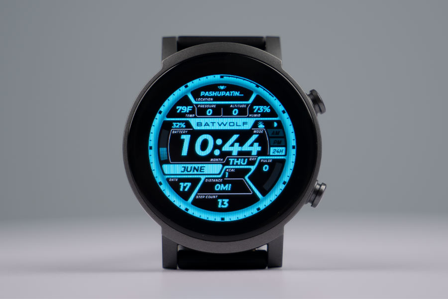
Despite this, I’ve had no issue regarding outdoor visibility on the Mobvoi TicWatch E3 all through the review. Sure, things get a little difficult under direct sunlight but it’s not that big a deal. Moving on, the Wear OS platform means this smartwatch lets you choose from thousands of watch faces that you can download from the Play Store. The ones built-in are no slouch either.
Review Images
1/3
I’m quite fond of this design called “Futurist” which displays all the essential information in a pretty cool layout. But I did notice one of several bugs on the Mobvoi app when trying to switch between dial faces.
Here, the app seems to have clearly separated paid and free ones with a label. Seems to. However, even some of those that don’t display a price tag like this one called “Retro Wave” are behind a paywall. Talking about payment, the TicWatch E3 also features NFC payments through Google Pay.
"OK Google" works now
Getting to the UI, you’ll find the Google Assistant menu to the left of the homescreen whereas all the widgets or “Tiles” (as Google likes to call it) are located on the right. If you recall our review of the OPPO Watch, you’ll know that the “Ok Google” hotword was broken in all Wear OS-powered smartwatches until then.
Thankfully, Google finally rolled out an update fixing this problem back in March. And now, you can trigger the assistant with the “Ok Google” or “Hey Google” command—and receive speech output accordingly.
Likewise, all the incoming notifications are timestamped and chronologically stored on the bottom layout of the UI. You can also switch between three levels of notification previews that vary in different levels of obtrusiveness. Unseen notifications can are also marked with a little icon.
Similarly, the command center on the top is home to the settings menu alongside brightness control, DND, airplane mode, and other options. Mobvoi TicWatch E3 also supports music playback control, which gets its place in the command center as well. Despite featuring an LCD panel, this smartwatch also supports Always-on Display, where it grayscales the watch face.
But considering its battery-consuming properties and sheer imperfect implementation, I chose not to turn on AoD here. Plus, both “raise to wake” and “tap to wake” functions work perfectly fine. Moreover, the Wear OS gestures like "flick to launch" notification panel, menu, or command center don’t leave much room for complaint either. But I will say it hesitates to do its job well when you’re lying flat.
Performance, Wear OS
- Qualcomm Snapdragon Wear 4100 (12nm)
- 1GB RAM, 8GB internal storage, Wear OS
What’s next? Yes, allow me to get into the performance side of things now. Like I mentioned in the beginning, Mobvoi chose to retain top-notch hardware from the TicWatch Pro 3, while compromising on aspects like design and display to be able to deliver this smartwatch. And boy am I glad about this decision.
Powered by the flagship-grade Qualcomm Snapdragon Wear 4100 chipset, everything’s so, so smooth here. To note, besides the Pro 3, TicWatch E3 is the only other smartwatch to feature this powerful silicon. Complementing this is 1GB RAM and 8GB of internal storage.
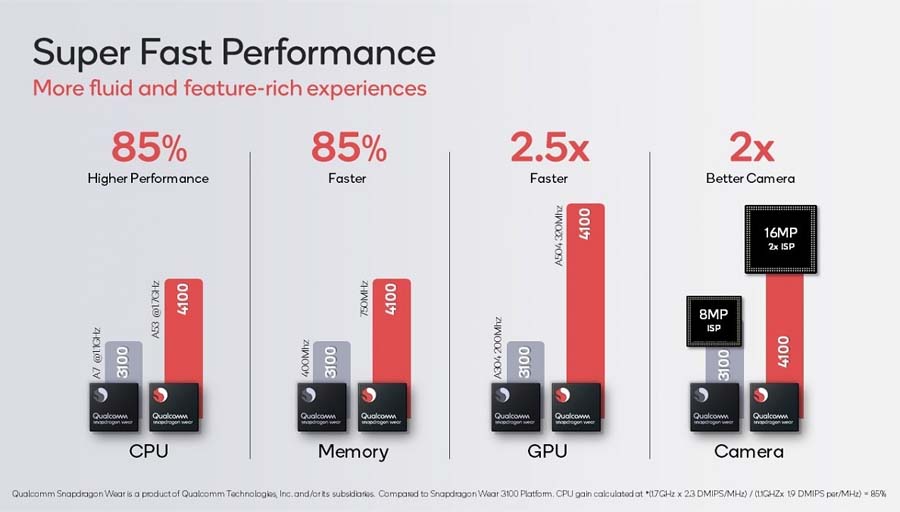
Compared to its predecessor, the Wear 3100 (28nm) from back in 2018, Qualcomm says Wear 4100 offers 85% better CPU and memory performance, 2.5x faster GPU, and 2x better camera experience.
Manufactured under a power-efficient 12nm process, this chip promises superior battery endurance as well. Seeing other watchmakers still not upgrade to this objectively supreme chipset is a little puzzling though. But if rumors are to be believed, the upcoming smartwatches from OPPO and Motorola will indeed be powered by Snapdragon Wear 4100.
Wear 4100 vs 4100+
Qualcomm also has a slightly better wearable platform, which is the Wear 4100+. Between the two, the only difference is that the plus variant also features an AON co-processor for handling ambient tasks like heart-rate monitoring, AoD, for efficient resource and power management.
Anyway, I’m loving the Wear OS experience on the TicWatch E3 so far. From launching apps, selecting menus, to UI transitions, it’s smooth sailing here. Because of the built-in WiFi, you don’t need to rely on a smartphone to download apps or such either. The incoming notifications are actionable, of course.
Plus, it supports emojis, Nepali Unicode font, and even images. Sweet! However, the built-in vibration motor is too weak—to the point where I’ve missed multiple alerts. And this is not something that can be fixed by a firmware update.
You can choose to type up replies, use Text-To-Speech (TTS), select from available emojis, or use smart reply for messages. Surprisingly, swipe typing on such a small screen has been quite accurate throughout my usage.
Google has improved Wear OS
Then there’s the freedom to install from thousands of apps on the Play Store. This is something Wear OS takes pride in compared to smartwatch platforms from other vendors like Samsung’s Tizen OS and Huawei’s LiteOS. From Google Maps, Telegram, Viber, Spotify, Shazam, to AccuWeather, it’s all here.
All the apps are arranged in a block-style fashion under the Mobvoi launcher. Here, the said apps aren’t alphabetically ordered although you can make it so.
But if you prefer the classic Wear OS layout instead, there’s the option to enable Google’s default launcher as well. 8GB of internal storage is plenty enough for a smartwatch but unlike Huawei, Amazfit smartwatches, you can’t locally store music here. As a result, you’ll have to carry your smartwatch during your workout sessions—in case you wish to stream some tunes along the way.
TicWatch E3 also supports making calls and messages—from the watch itself. But in a couple of instances, I noticed how canceling a call from the watch didn’t actually work. The phone call UI would go away with the outgoing call still in progress. Weird. Now, talking about the call quality itself, it’s pretty impressive. People on the receiving end described my voice as loud and clear.
Despite this, the onboard speaker is sub-par only since calls sound a little noisy here. Tech enthusiasts will also know that Google and Samsung recently inked a deal to merge Wear and Tizen OS—two of the best smartwatch platforms. With the powerful chipset at the helm, I am hopeful that the TicWatch E3 will get this update too.
Health, Fitness Tracking
- 21 workout modes with automatic detection of 3
- Blood oxygen, heart-rate monitoring, built-in GPS
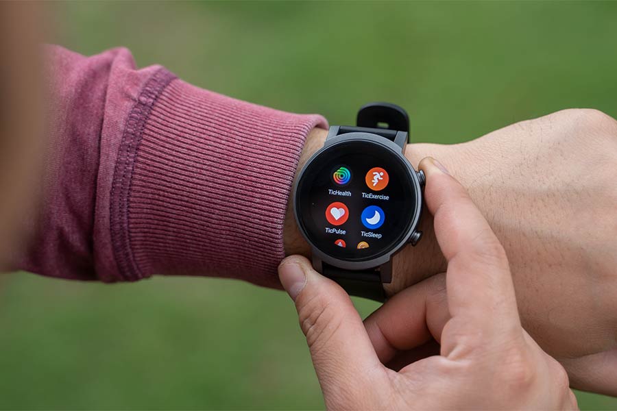
In terms of health and fitness tracking features, this smartwatch brings Mobvoi’s portfolio of solutions under the “Tic” branding—alongside similar alternatives from Google. For the purposes of this review, I tested all the health-related features of Mobvoi TicWatch E3 via the company's Tic-branded options.
Regardless, the TicWatch E3 brags 21 workout modes under TicExercise. This includes outdoor run/walk, indoor run/cycle, pool swimming, basketball, mountaineering, and more. As expected, this smartwatch boasts auto workout detection as well. Mobvoi calls it TicMotion but disappointingly, it can only recognize three types of exercises: walk, run, and cycle.
Review Images
1/4
You can select which ones to turn on/off, but seeing how even budget fitness trackers like the Huawei Band 6 and Mi Band 6 can detect up to 6 types of workouts, the TicWatch E3’s limitation feels almost embarrassing. Nonetheless, for the available ones, it does auto workout recognition better.
Auto workout detection works fine
Throughout the review period, the Mobvoi TicWatch E3 was able to accurately trace my workout sessions. It consisted of determining the kickoff time and when I ended my exercise. Its auto-pause feature is another handy tool to have. The watch even displays the duration of your break and resumes the workout automatically once it detects you’re on the move.
Besides the standard metrics like heart rate, calories, distance, and speed, the E3 can also monitor VO2Max levels all through the exercise and even lap your workouts.
And thanks to the built-in GPS, it eliminates the need to carry around a smartphone to trail your exercises as well. It works best when using in conjunction with a phone but that’s not elementary. By itself, the TicWatch E3 was able to lock to a GPS signal impressively fast enough—be it indoors or outdoors.
Review Images
1/3
To compare, this is comparatively quicker than other smartwatches I’ve tested so far like the Huawei Watch GT 2 Pro, Amazfit T-Rex, and Fitbit Versa 3. Looking at the recorded map in the Mobvoi app, I can’t complain about the accuracy either.
Still, this is a relatively inferior navigation system compared to the TicWatch Pro 3. That’s because this big-budget smartwatch supports five standards of satellite positioning system compared to E3’s three. Even so, this shouldn’t matter at all to most users.
HIIT for professionals
If you’re a professional athlete who undergoes high-intensity interval training (HIIT), then there’s something in store here. It lets you choose from 11 different HIIT exercise modes with the ability to set duration, count, and break time between up to three modes. Plus, if you regularly train under a select group of exercises, the TicWatch E3 also lets you save them as presets.
Apart from this, there is practically every health monitoring feature here, that you’d expect from a flagship smartwatch. It has 24-hour heart rate (TicPulse), SpO2 (TicOxygen), stress (TicZen), and sleep (TicSleep) monitoring.
Still, their “all-day” aspect is a little questionable. It can deliver resting heart rate level on-request… just like that. Yet, looking up the 24-hour data, we can notice that it settles for hourly records only. And this is true for blood oxygen monitoring too.
Review Images
1/3
Daily
Nevertheless, you can enable alerts against abnormal heart rate during regular usage or when you’re in a workout. TicWatch E3 also graphs your daily heart raze zones under different categories like anaerobic, cardio, fat burn, warm up, and resting for a detailed insight. But weirdly enough, this data is only available on the watch, and not on the companion app.
Continuous blood oxygen monitoring
Moving on, continuous SpO2 tracking has been one of the most sought-after features in modern smartwatch/fitness trackers and this device doesn’t disappoint. The watch can also remind you of abnormal blood oxygen levels which is fantastic.
Review Images
1/3
Daily
But since it requires staying incredibly still to get a measurement, the 24-hour blood oxygen monitoring fails to deliver. Therefore, most of my SpO2 charts read empty with no data during different hourly intervals throughout the day. Likewise, its stress recording is quite impressive. However, having to stay perfectly still to get a measurement substracts a comprehensive all-day readout.
Review Images
1/2
Daily Chart
And God almighty, the manual stress monitoring on TicWatch E3 is the slowest I’ve ever seen on a smartwatch—or even a fitness band. Mobvoi has also complemented this with breathing exercises under TicBreathe—which maxes out at up to 5 minutes.
Review Images
1/3
Daily
Inspired by Apple Watch, the company has also included noise level monitoring here. But unlike an Apple Watch, the TicHearing app can’t run in the background.
Inconsistent sleep tracking
In any way, sleep monitoring on this smartwatch has been pretty much spot-on during my usage in terms of my time to bed and the time I got up. But for reasons unknown, the watch has recorded me being awake mid-sleep practically every day. I can absolutely vouch for its inaccuracy because I tend to sleep like a log.
Review Images
1/6
Daily
Anyway, Mobvoi substitutes sleep score found in most other smartwatches with sleep efficiency instead—which is the same thing but it’s represented in percentage. Besides this, the TicWatch E3 records your nightly heart rate and SpO2 levels as well.
The companion app needs work—a lot of it
All these data sync with the Mobvoi app while the initial setup also requires you to install the Wear OS app. And I must say, the company has a lot of work cut out for it with regards to its app if it wants to level with the industry’s front runners.
Review Images
1/6
Dashboard
Maybe it was in preparation for the launch of TicWatch E3 but Mobvoi recently updated the UI/UX of its companion app. But besides the newer visuals, it doesn’t compare to something like the Huawei Health app.
I feel like this is only the simplest extension of the data that can be visualized on the watch itself. Yes, it does retain historical records and the detail of many aspects at length but that’s about it.
You can’t read the specific data in the chart by clicking on it, so having to manually align the data on the Y-axis is an unnecessary challenge. The map of your workout route can't be zoomed in either. It’s just so… basic. Additionally, the entire “Explore” tab feels like an elaborate ad for Mobvoi’s portfolio of products. Also, it’s almost criminal for an app to lack native dark mode in 2021.
Review Images
1/3
Account
Thankfully, you can sync TicWatch E3’s data to other apps like Google Fit, Strava, and Runkeeper. There’s also something called “TicCare” under which you can share your health data with other TicWatch users and vice-versa. And another interesting feature here is audio recording and AI transcribing. The transcribing part works pretty fine but Mobvoi has been greedy enough in limiting the feature to just 1 hour.
Battery
- 380mAh battery, Up to 1.5 days
- Proprietary magnetic pin charging
Finally, let’s get into the battery section of this review of the Mobvoi TicWatch E3. Because of its Wear OS heritage, it expectedly can’t last as long as those from Huawei and Amazfit. Here, it is fueled by a 380mAh battery which should last between 1 – 1.5 days according to the company. And that’s precisely what my tests have concluded.
With brightness set to level two, every health monitoring feature turned on, the watch connected to my phone at all times, WiFi set to auto, and around 50 minutes of GPS usage, it lasted me for around 23.5 hours.
But with the built-in GPS turned off, I managed to go about 32 hours without having to juice it up. If you’re low on power, the Essential Mode comes to the rescue, which turns on automatically once the battery level hits 5% too.
Essential mode for the best battery life
I haven’t tested the watch under this mode to confirm its battery endurance, but turning this on should give you at least a couple of weeks of battery life. For longer endurance, this mode restricts your smartwatch experience to the most basic info only—and resting heart rate level when pressing the bottom right button.
On the charging front, the TicWatch E3 uses a proprietary bean-shaped magnetic connector. It latches onto the watch pretty firmly so no problem there. But like Pro 3, this one is void of wireless charging as well. At any rate, the onboard charger takes around 1 hour and 34 minutes to fully juice up. Unfortunately, it doesn't support wireless charging.
Conclusion
Time to wrap up this review of the Mobvoi TicWatch E3. Fair to say, I’m thoroughly impressed with what the company has managed to deliver with the TicWatch E3. It’s almost like a flagship killer for smartwatches. The powerful Wear 4100 platform makes the Wear OS experience oh-so enjoyable on this relatively affordable device of its kind.
For core fitness enthusiasts, the company’s decision to cut costs in the design and display department to offer a supreme smartwatch experience with a bunch of health tracking features makes all the sense. Yet, that’s not to say the E3 is perfect—even disregarding its inferior build quality, soft vibration motor, LCD screen, and lack of wireless charging.
There are a few inconsistencies with the exercise modes, and the sleep monitoring also requires further refinement. Not to forget, the Mobvoi companion app still has a long way to go as well. Despite all this, I still believe that the TicWatch E3 is an excellent value-for-money smartwatch—easily outclassing most other alternatives inside the $200 price range.
- Watch our video review of the Mobvoi TicWatch E3.
- Excellent value for money
- Flagship-level performance
- Great third-party app support
- IP68 dust and water-resistant
- Built-in GPS works perfectly
- Decent phone call quality
- 20mm universal strap design
- Several health tracking features
- Polycarbonate watch case
- LCD screen with muted colors
- Big bezel looks unappealing
- Pretty weak vibration motor
- Sleep tracking is inconsistent
- Not the best at battery life
- No wireless charging support

To say something about myself, I have been writing tech and gadgets from 2021. Although coming from a non technical studies background, I'm someone who is always fascinated by the latest gadget and tech innovations, circling around. Besides writing, you'll find me listening music and aligning the stars through astrology and sometimes even, tarot cards! 😉🧿
Comments
No comments yet. Add a comment to start a discussion


